Plotting
Scatter Graphs
Simple Plot
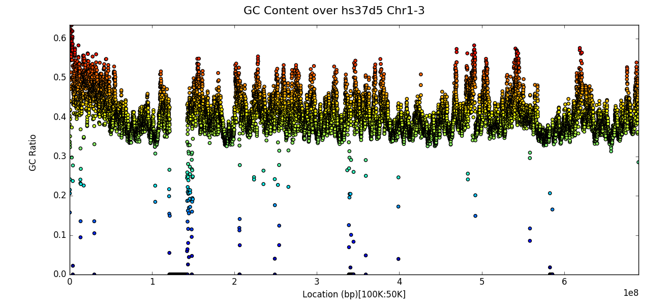
After executing a census one can use the plot function to create a
scatter graph of results. The x axis is the location along the
genome (with ordered chromosomes or contigs appearing sequentially) and
the y axis is the value of the censused region according to the
strategy used. The example below plots GC content ratio across the first
three chromosomes of the hs37d5 reference sequence, with a window
size of 100,000 and a step or overlap of 50,000. Note that the plot
title may be specified with the title keyword argument.
from goldilocks import Goldilocks
from goldilocks.strategies import GCRatioStrategy

sequence_data = {
    "my_sequence": {"file": "/store/ref/hs37d5.1-3.fa.fai"},
}
g = Goldilocks(GCRatioStrategy(), sequence_data, length="100K", stride="50K", is_faidx=True)
g.plot(title="GC Content over hs37d5 Chr1-3")
Line Graphs
Plot multiple contigs or chromosomes from one sample
For long genomes or a census with a small window size, simple plots as
shown in the previous section can appear too crowded and thus difficult
to extract information from. One can instead plot, for a given input
sample, a panel of census region data, by chromosome by specifying the
name of the sample as the first parameter to the plot function as
per the example below:
from goldilocks import Goldilocks
from goldilocks.strategies import GCRatioStrategy

sequence_data = {
    "hs37d5": {"file": "/store/ref/hs37d5.1-3.fa.fai"},
    "GRCh38": {"file": "/store/ref/Homo_sapiens.GRCh38.dna.chromosome.1-3.fa.fai"},
}
g = Goldilocks(GCRatioStrategy(), sequence_data, length="1M", stride="250K", is_faidx=True)
g.plot("hs37d5", title="GC Content over hs37d5 Chr1-3")
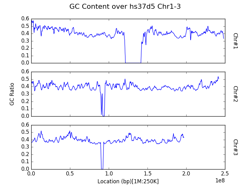
Note that both the x and y axes are shared between all panels to
avoid the automatic creation of graphics with the potential to mislead
readers on a first glance by not featuring the same axes ticks.
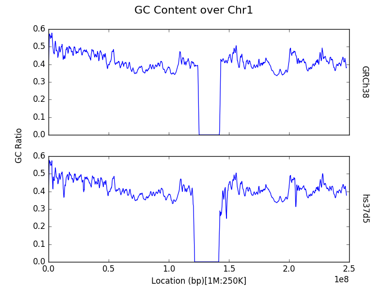
Plot a contig or chromosome from multiple samples
By default, data within the census is aggregated by region across all
input samples (in the sequence_data dictionary) for the entire
genome. However, one may be interested in comparisons across samples,
rather than between chromosomes in a single sample. One can plot the
census results for a specific contig or chromosome for each of the input
samples, by specifying the chrom keyword argument to the plot
function. Take note that the argument refers to the sequence that
appears as the i’th contig of each of the input FASTA and not the actual
name or identifier of the chromosome itself.
from goldilocks import Goldilocks
from goldilocks.strategies import GCRatioStrategy

sequence_data = {
    "hs37d5": {"file": "/store/ref/hs37d5.1.fa.fai"},
    "GRCh38": {"file": "/store/ref/Homo_sapiens.GRCh38.dna.chromosome.1.fa.fai"},
}
g = Goldilocks(GCRatioStrategy(), sequence_data, length="1M", stride="250K", is_faidx=True)
g.plot(chrom=1, title="GC Content over Chr1")
Histograms
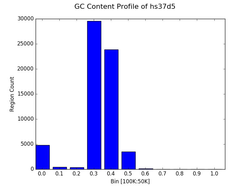
Simple profile (binning) plot
Rather than inspection of individual data points, one may want to know
how census data behaves as a whole. The plot function provides
functionality to profile the results of a census through a histogram.
Users can do this by providing a list of bins to the bins keyword
argument of the plot function, following a census.
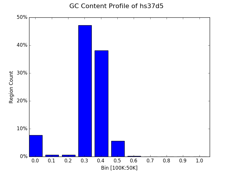
The example below shows the distribution of GC content ratio across the
hs37d5 reference sequence for all 100Kbp regions (and step of
50Kbp). The x axis is the bin and the y axis represents the
number of censused regions that fell into a particular bin.
from goldilocks import Goldilocks
from goldilocks.strategies import GCRatioStrategy

sequence_data = {
    "my_sequence": {"file": "/store/ref/hs37d5.fa.fai"}
}

g = Goldilocks(GCRatioStrategy(), sequence_data,
        length="100K", stride="50K", is_faidx=True)

g.plot(bins=[0.0, 0.1, 0.2, 0.3, 0.4, 0.5, 0.6, 0.7, 0.8, 0.9, 1.0],
    title="GC Content Profile of hs37d5"
)
Simpler profile (binning) plot
It’s trivial to select some sensible bins for the plotting of GC content as we know that the value for each region must fall between 0 and 1. However, many strategies will have an unknown minimum and maximum value and it can thus be difficult to select a suitable binning strategy without resorting to trial and error.
Thus the plot function permits a single integer to be provided to
the bins keyword instead of a list. This will automatically create
\(N+1\) equally sized bins (reserving a special bin for 0.0) between
0 and the maximum observed value for the census. It is also possible to
manually set the size of the largest bin with the bin_max keyword
argument. The following example creates the same graph as the previous
subsection, but without explicitly providing a list of bins.
from goldilocks import Goldilocks
from goldilocks.strategies import GCRatioStrategy

sequence_data = {
    "my_sequence": {"file": "/store/ref/hs37d5.fa.fai"},
}
g = Goldilocks(GCRatioStrategy(), sequence_data, length="100K", stride="50K", is_faidx=True)
g.plot(bins=10, bin_max=1.0, title="GC Content Profile of hs37d5")
Proportional bin plot
Often it can be useful to compare the size of bins in terms of their
proportion rather than raw counts alone. This can be accomplished by
specifying prop=True to plot. The y axis is now the
percentage of all regions that were placed in a particular bin instead
of the raw count.
from goldilocks import Goldilocks
from goldilocks.strategies import GCRatioStrategy

sequence_data = {
    "my_sequence": {"file": "/store/ref/hs37d5.fa.fai"}
}

g = Goldilocks(GCRatioStrategy(), sequence_data,
        length="100K", stride="50K", is_faidx=True)
g.plot(bins=10, bin_max=1.0, prop=True, title="GC Content Profile of hs37d5")
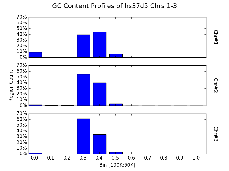
Bin multiple contigs or chromosomes from one sample
As demonstrated with the line plots earlier, one may also specify a
sample name as the first parameter to plot to create a figure with
each contig or chromosome’s histogram on an individual panel.
from goldilocks import Goldilocks
from goldilocks.strategies import GCRatioStrategy

sequence_data = {
    "my_sequence": {"file": "/store/ref/hs37d5.1-3.fa.fai"}
}

g = Goldilocks(GCRatioStrategy(), sequence_data,
        length="100K", stride="50K", is_faidx=True)

g.plot("my_sequence",
    bins=10, bin_max=1.0, prop=True, title="GC Content Profiles of hs37d5 Chrs 1-3")
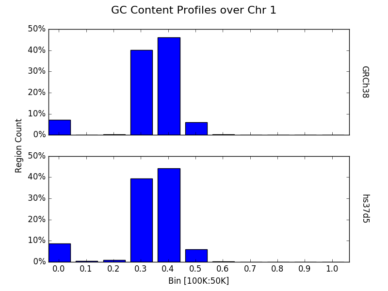
Bin a contig or chromosome from multiple samples
Similarly, one may want to profile a single contig or chromosome between each input group as previously demonstrated by the line graphs.
from goldilocks import Goldilocks
from goldilocks.strategies import GCRatioStrategy

sequence_data = {
    "hs37d5": {"file": "/store/ref/hs37d5.1.fa.fai"},
    "GRCh38": {"file": "/store/ref/Homo_sapiens.GRCh38.dna.chromosome.1.fa.fai"}
}

g = Goldilocks(GCRatioStrategy(), sequence_data,
        length="100K", stride="50K", is_faidx=True)
g.plot(chrom=1, bins=10, bin_max=1.0, prop=True, title="GC Content Profiles over Chr 1")
Advanced
Plot data from multiple counting tracks from one sample’s chromosomes
The examples thus far have demonstrated plotting the results of a
strategy responsible for counting one interesting property. But strategies are capable of counting
multiple targets of interest simultaneously. Of course, one may wish to
plot the results of all tracks rather than just the totals - especially
for cases such as nucleotide counting where the sum of all counts will
typically equal the size of the census region! The plot function
accepts a list of track names to plot via the tracks keyword
argument. Each counting track is then drawn on the same panel for the
appropriate chromosome. A suitable legend is automatically placed at the
top of the figure.
from goldilocks import Goldilocks
from goldilocks.strategies import NucleotideCounterStrategy

sequence_data = {
    "hs37d5": {"file": "/store/ref/hs37d5.1-3.fa.fai"},
}

g = Goldilocks(NucleotideCounterStrategy(["A", "C", "G", "T", "N"]), sequence_data,
        length="1M", stride="500K", is_faidx=True, processes=4)
g.plot(group="hs37d5", prop=True, tracks=["A", "C", "G", "T", "N"])
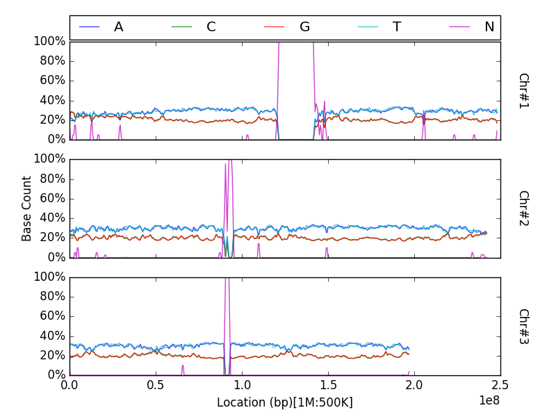
Note that prop is not a required argument, but can still be used
with the tracks list to plot counts proportionally.
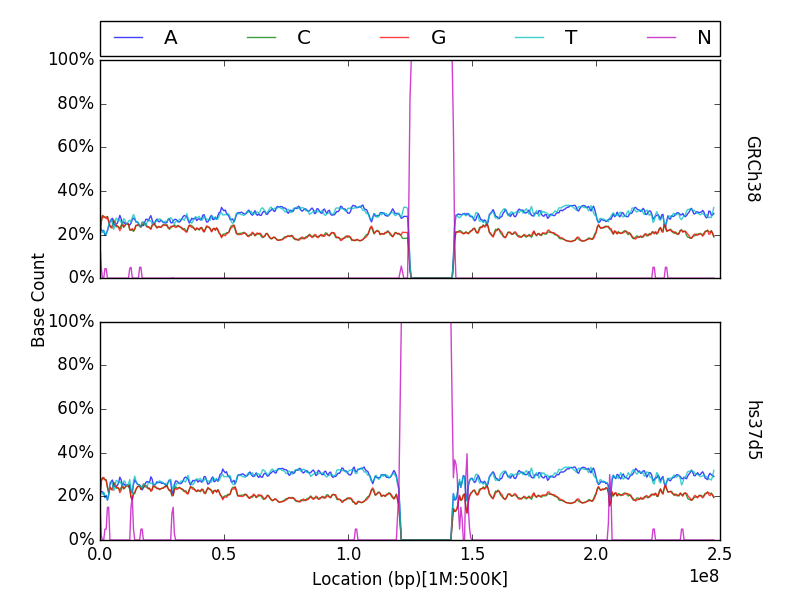
Plot data from multiple counting tracks for one chromosome across many samples
As previously demonstrated, one can use the chrom keyword
argument for plot to create a figure featuring a panel per input
sample, displaying census results for a particular chromosome.
Similarly, this feature is supported when plotting multiple tracks with
the tracks keyword.
from goldilocks import Goldilocks
from goldilocks.strategies import NucleotideCounterStrategy

sequence_data = {
    "hs37d5": {"file": "/store/ref/hs37d5.1.fa.fai"},
    "GRCh38": {"file": "/store/ref/Homo_sapiens.GRCh38.dna.chromosome.1.fa.fai"},
}

g = Goldilocks(NucleotideCounterStrategy(["A", "C", "G", "T", "N"]), sequence_data,
        length="1M", stride="500K", is_faidx=True, processes=4)
g.plot(chrom=1, prop=True, tracks=["A", "C", "G", "T", "N"])
Integration with external plotting tools
ggplot2
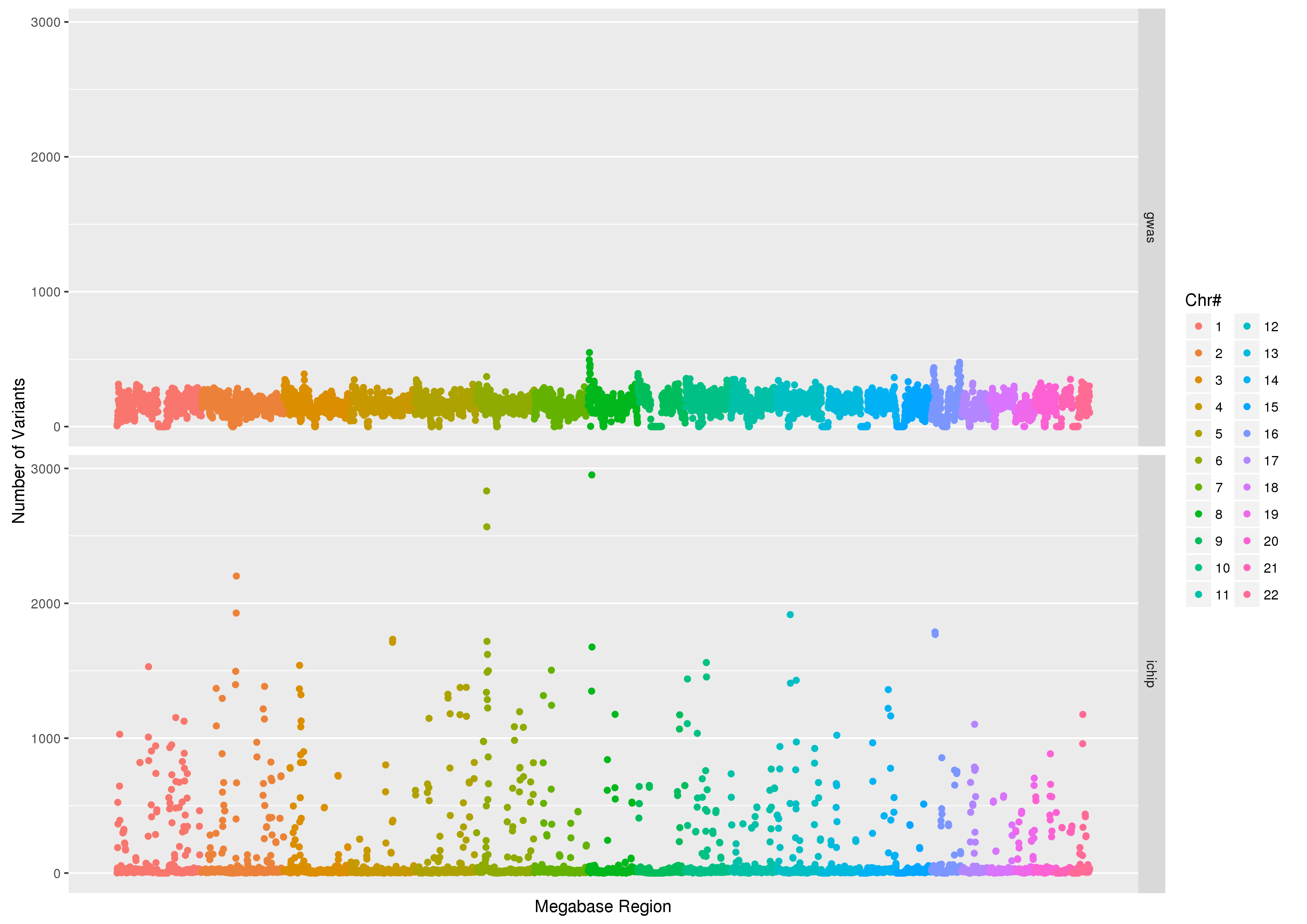
Plotting packages such as ggplot2 favour ``melted” input.
The figure below was created using
data from Goldilocks as part of our quality control study, the scatter
plot compares the density of SNPs between the GWAS and SNP chip studies
across the human genome.
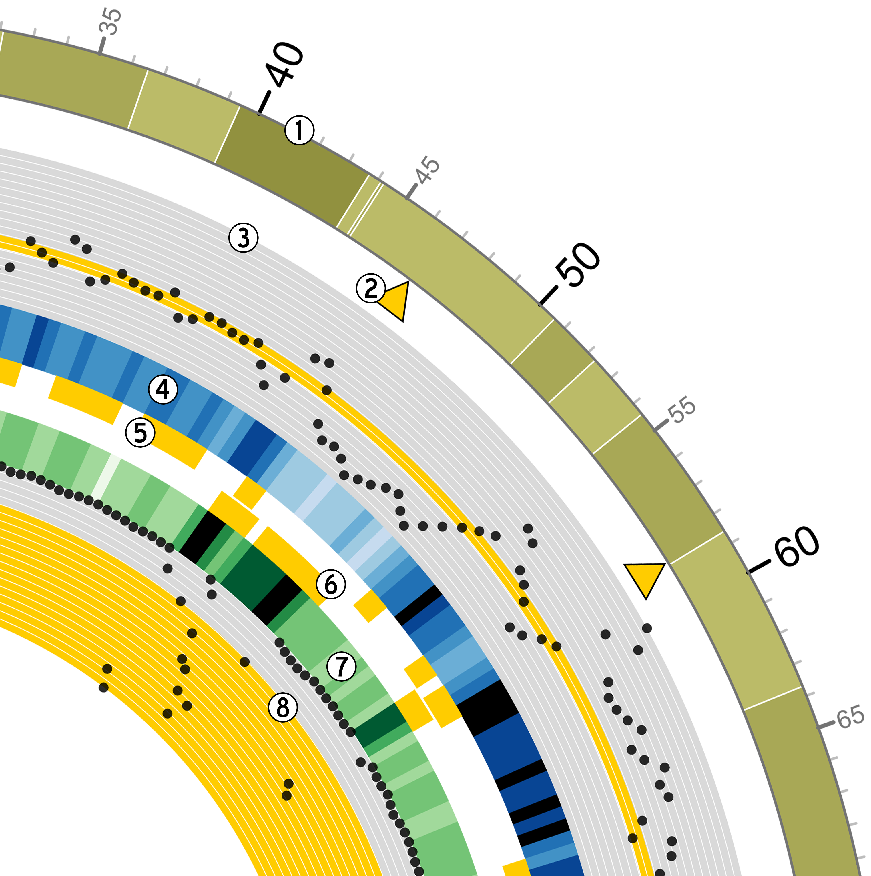
Circos
Goldilocks has an output format
specifically designed to output information for use with the ``popular
and pretty” circos visualisation tool. Below is an example of a
figure that can be generated from data gathered by Goldilocks. The
figure visualises the selection of regions from our original quality
control study. The Python script used to generate the data and the Circos
configuration follow.
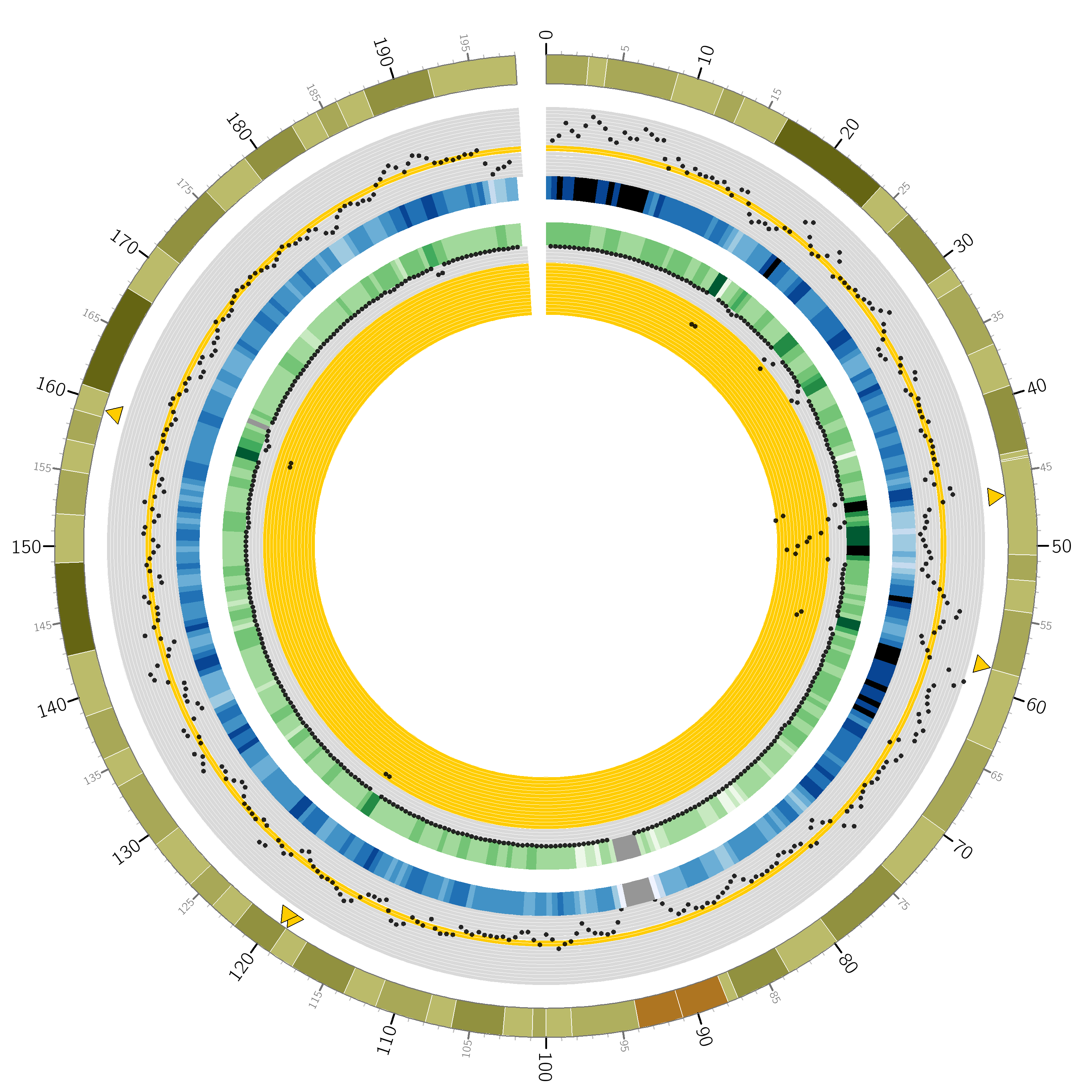
Python script
from goldilocks import Goldilocks
from goldilocks.strategies import PositionCounterStrategy

sequence_data = {
    "gwas": {"file": "/encrypt/ngsqc/vcf/cd-seq.vcf.q"},
    "ichip": {"file": "/encrypt/ngsqc/vcf/cd-ichip.vcf.q"},
}

g = Goldilocks(PositionCounterStrategy(), sequence_data,
        length="1M", stride="500K", is_pos_file=True)

# Query for regions that meet all criteria across both sample groups
# The output file goldilocks.circ is used to plot the yellow triangular indicators
g.query("median", percentile_distance=20, group="gwas", exclusions={"chr": [6]})
g.query("max", percentile_distance=5, group="ichip")
g.export_meta(fmt="circos", group="total", value_bool=True, chr_prefix="hs", to="goldilocks.circ")

# Reset the regions selected and saved by queries
g.reset_candidates()

# Export all region counts for both groups individually
# The -all.circ files are used to plot the scatter plots and heatmaps
g.export_meta(fmt="circos", group="gwas", chr_prefix="hs", to="gwas-all.circ")
g.export_meta(fmt="circos", group="ichip", chr_prefix="hs", to="ichip-all.circ")

# Export region counts for the groups where the criteria are met
# The -candidates.circ files are used to plot the yellow 'bricks' that
#   appear between the two middle heatmaps
g.query("median", percentile_distance=20, group="gwas")
g.export_meta(fmt="circos", group="gwas", to="gwas-candidates.circ")
g.reset_candidates()
g.query("max", percentile_distance=5, group="ichip")
g.export_meta(fmt="circos", group="ichip", to="ichip-candidates.circ")
g.reset_candidates()
Circos configuration
# circos.conf
<colors>
gold = 255, 204, 0
</colors>

karyotype = data/karyotype/karyotype.human.hg19.txt
chromosomes_units           = 1000000
chromosomes_display_default = no
chromosomes = hs3;

<ideogram>

<spacing>
default = 0.01r
break   = 2u
</spacing>


# Ideogram position, fill and outline
radius    = 0.9r
thickness = 80p
fill      = yes
stroke_color     = dgrey
stroke_thickness = 3p

# Bands
show_bands = yes
band_transparency = 4
fill_bands            = yes
band_stroke_thickness = 2
band_stroke_color     = white

# Labels
show_label     = no
label_font       = default
label_radius     = 1r + 75p
label_size     = 72
label_parallel   = yes
label_case     = upper

</ideogram>

# Ticks
show_ticks          = yes
show_tick_labels    = yes

<ticks>

label_font       = default
radius               = dims(ideogram,radius_outer)
label_offset         = 5p
orientation          = out
label_multiplier     = 1e-6
color                = black
chromosomes_display_default = yes

<tick>
    spacing = 1u
    size = 10p
    thickness = 3p
    color = lgrey
    show_label = no
</tick>

<tick>
    spacing = 5u
    size = 20p
    thickness = 5p
    color = dgrey
    show_label = yes
    label_size = 24p
    label_offset = 0p
    format = %d
</tick>

<tick>
    spacing = 10u
    size = 30p
    thickness = 5p
    color = black
    show_label = yes
    label_size = 40p
    label_offset = 5p
    format = %d
</tick>

</ticks>

track_width = 0.05
track_pad   = 0.02
track_start = 0.95

<plots>
<plot>
    type            = scatter
    file        = goldilocks.circ
    r1      = 0.98r
    r0      = 0.95r
    orientation = out

    glyph = triangle
    #glyph_rotation = 180
    glyph_size = 50p

    color     = gold
    stroke_thickness = 2p
    stroke_color = black

    min = 0
    max = 1

</plot>
<plot>
    type  = scatter

    file    = gwas-all.circ
    r1      = 0.95r
    r0      = 0.80r

    fill = no
    fill_color       = black
    color = black_a1
    stroke_color     = black
    glyph            = circle
    glyph_size       = 12

    <backgrounds>
        <background>
            color = vlgrey
            y0    = 207
        </background>
        <background>
            color = vlgrey
            y1    = 207
            y0    = 179
        </background>
        <background>
            color = gold
            y1    = 179
            y0    = 148
        </background>
        <background>
            color = vlgrey
            y1    = 145
            y0    = 122
        </background>
        <background>
            color = vlgrey
            y1    = 122
            y0    = 0
        </background>
    </backgrounds>

    <axes>
        <axis>
            color     = white
            thickness = 1
            spacing   = 0.05r
        </axis>
    </axes>
    <rules>
        <rule>
            condition  = var(value) < 1
            show = no
        </rule>
    </rules>
</plot>
<plot>
    type    = heatmap
    file    = gwas-all.circ

    # color list
    color   = grey,vvlblue,vlblue,lblue,blue,dblue,vdblue,vvdblue,black
    r1      = 0.80r
    r0      = 0.75r

    scale_log_base = 0.75
    color_mapping = 2
    min = 1
    max = 267 # 95%
</plot>

<plot>
    type            = tile
    layers_overflow = collapse
    file        = gwas-candidates.circ
    r1      = 0.7495r
    r0      = 0.73r
    orientation = in

    layers      = 1
    margin      = 0.0u
    thickness   = 30p
    padding     = 8p

    color     = gold
    stroke_thickness = 0
    stroke_color = gold
</plot>
<plot>
    type            = tile
    layers_overflow = collapse
    file        = ichip-candidates.circ
    r1      = 0.73r
    r0      = 0.70r
    orientation = out

    layers      = 1
    margin      = 0.0u
    thickness   = 30p
    padding     = 8p

    color     = gold
    stroke_color = gold
</plot>

<plot>
    type    = heatmap
    file    = ichip-all.circ

    # color list
    color   = grey,vvlgreen,vlgreen,lgreen,green,dgreen,vdgreen,vvdgreen,black
    r1      = 0.70r
    r0      = 0.65r

    min = 1
    max = 1097.71 # 99%
    color_mapping = 2
    scale_log_base = 0.2

</plot>
<plot>
    type  = scatter

    file    = ichip-all.circ
    r1      = 0.65r
    r0      = 0.50r
    orientation = in

    fill_color       = black
    stroke_color     = black
    glyph            = circle
    glyph_size       = 12
    color = black_a1

    <backgrounds>
        <background>
            color = gold
            y0    = 379
        </background>
        <background>
            color = vlgrey
            y1    = 379
            y0    = 49
        </background>
        <background>
            color = vlgrey
            y1    = 49
            y0    = 0
        </background>
    </backgrounds>

    <axes>
        <axis>
            color     = white
            thickness = 1
            spacing   = 0.05r
        </axis>
    </axes>
    <rules>
        <rule>
            condition  = var(value) < 1
            show = no
        </rule>
    </rules>
</plot>

</plots>

################################################################
# The remaining content is standard and required. It is imported
# from default files in the Circos distribution.
#
# These should be present in every Circos configuration file and
# overridden as required. To see the content of these files,
# look in etc/ in the Circos distribution.

<image>
# Included from Circos distribution.
<<include etc/image.conf>>
</image>

# RGB/HSV color definitions, color lists, location of fonts, fill patterns.
# Included from Circos distribution.
<<include etc/colors_fonts_patterns.conf>>

# Debugging, I/O an dother system parameters
# Included from Circos distribution.
<<include etc/housekeeping.conf>>
anti_aliasing* = no